

Film is as much a business as it is an art, and as such it needs a way to advertise itself. One staple of film advertising from its very inception has been the simple poster, a one-sheet of information meant to entice the passer-by to pay for a ticket.
As with any creative medium, each passing year invokes new trends. Film is usually reflective of the world around it, and the marketing will usually try and capture the mood the picture is going for. This leads to some quite interesting styles emerging which could only happen at that time, under those circumstances.
So today, we’re going to go through a handful of posters from each decade, look at their similarities and differences, and how they compare to the ones from other years. Let’s start as early as we can, in the 1930’s. There were films before that of course, but this is the earliest we will delve in this piece.
1930s Film Posters

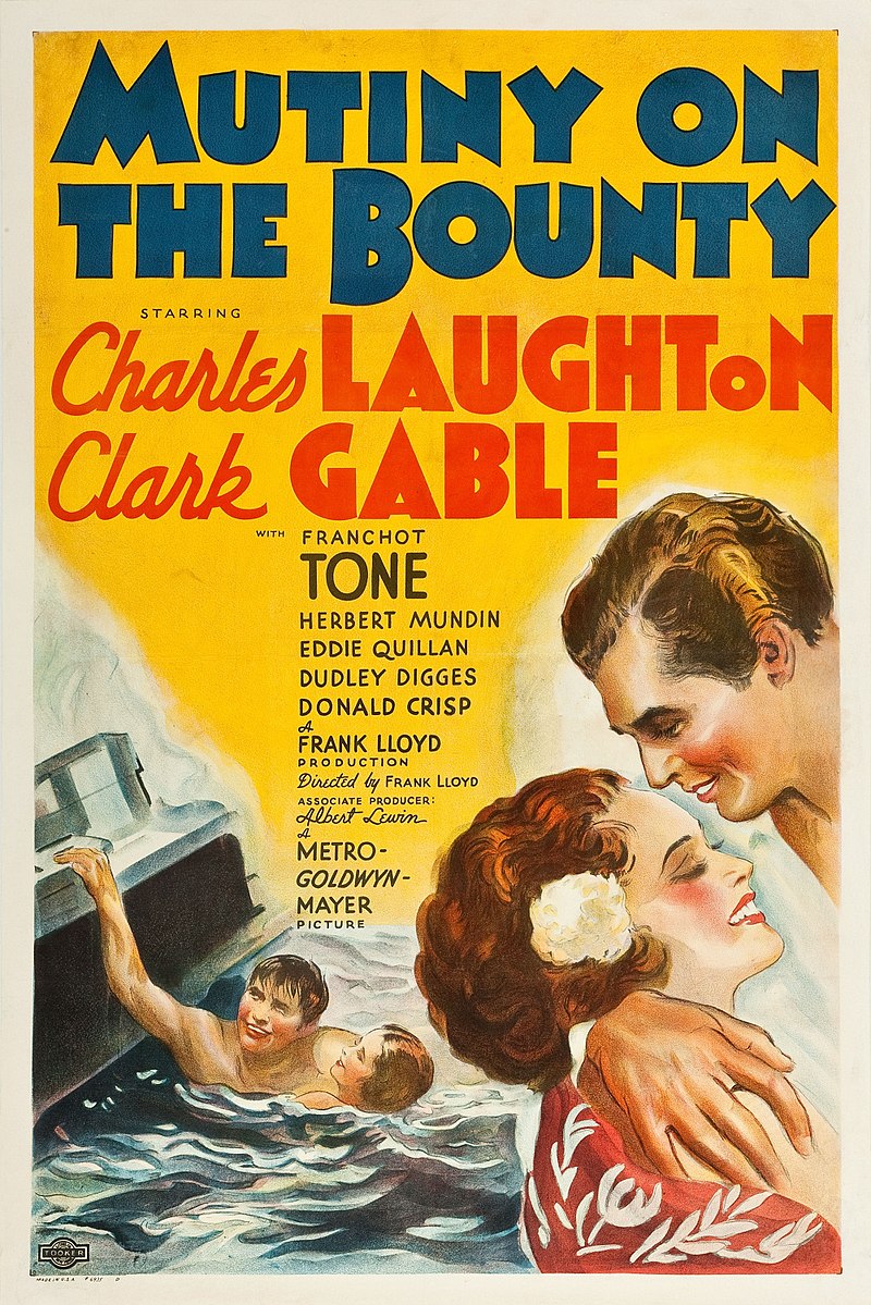
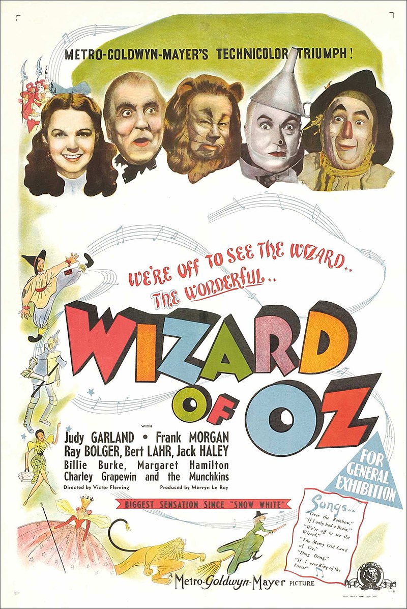
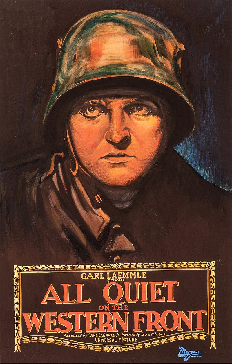
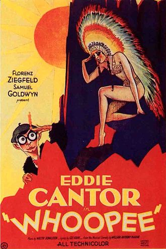
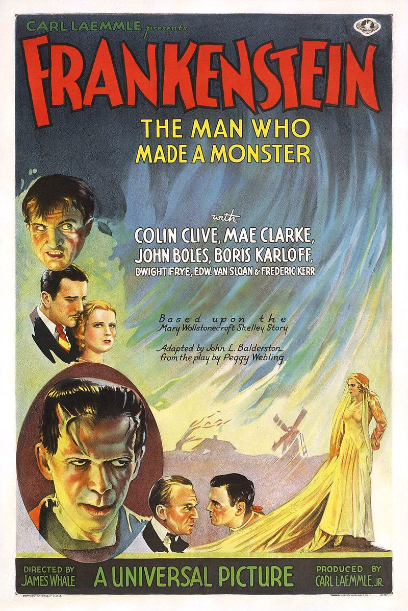
In the 1930s, most posters featured painted art. Whilst a few of them did feature the big film stars, they are somewhat less prevalent than in later decades. The main intention of these posters is to give cinema-goers an idea of what the tone of the film will be, as for many this would be the only information they have before buying a ticket.
1940s Film Posters


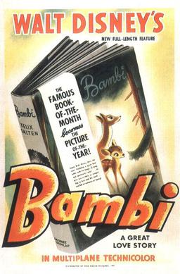
As we enter the 1940’s, we see an increased prevalence of the film star. They were often front and centre, and had become the main selling point of the film. Whilst photographic elements started being utilised more, painted art was still very common.
1950s Film Posters


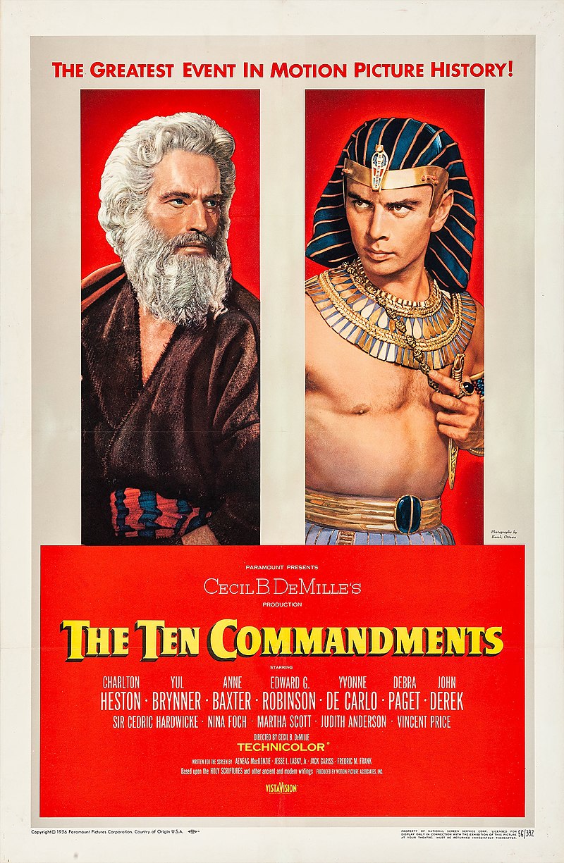


In the 50’s, we saw a continuation of the 40’s design. Interesting here is to see the emergence of advertising film technology front and centre, with films proudly announcing they were utilising CinemaScope or Technicolor. They also tended to utilise the colour red quite heavily.
1960s Film Posters
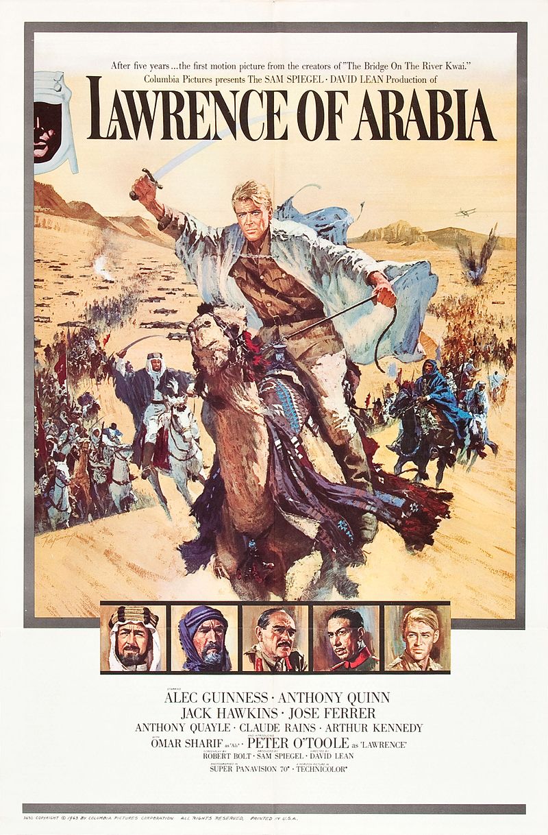
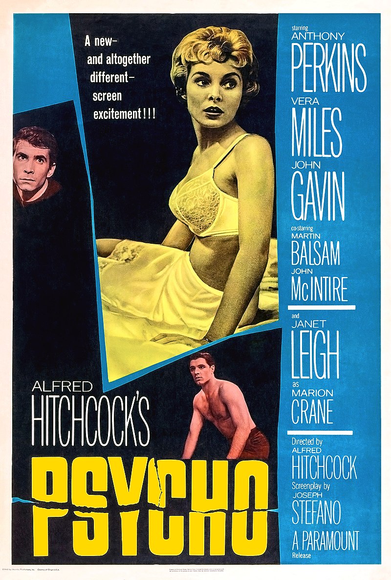


It’s the sixties, and the colour red is gone, replaced by lots of yellow. There was something of a return to painted designs in the sixties, and the designs started to become a little more minimalistic, focusing on fewer elements.
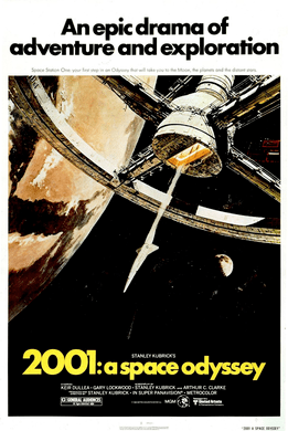
1970s Film Posters
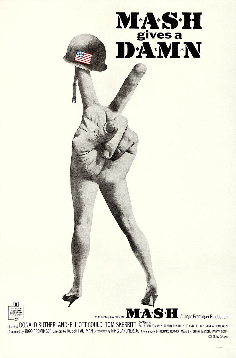


The seventies took that minimalism further. Posters in the seventies tended to feature much less prevalent text, with the main focus of the posters being on large, stylistic images designed to draw the cinemagoer in. Colours became far less saturated, with a heavier focus on black and white contrasts. There was also far less emphasis on the actors, with many posters not featuring the main stars.
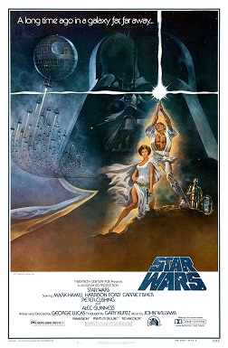
1980s Film Posters


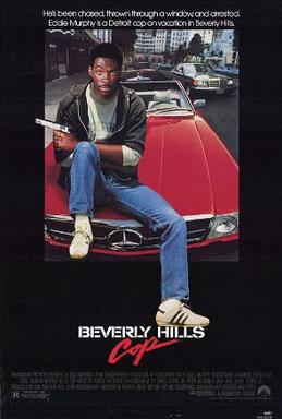


With the eighties, we saw the rise of the logo. After Star Wars, every film wanted to become a brand, and the advertising was often designed with that in mind. Text was disappearing further, usually relegated to very small sections in the top and bottom of the poster, but we saw the return of film stars again appearing in the poster.
1990s Film Posters
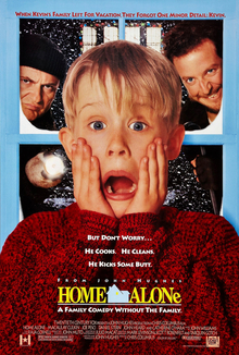


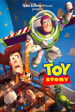
The nineties finally saw the complete death of painted imagery, now everything was photographic. Usually, posters included some kind of still from the movie, with a focus on the main star, or stars. We started to see a lot of the ‘faces in the sky’ trope during this period.
2000s Film Posters
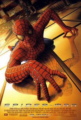
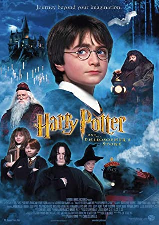

In the noughties, faces in the sky completely took over. Most posters features floating faces of the main actors, on some kind of background featuring imagery from the film.
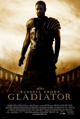
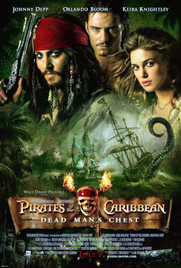
2010s Film Posters


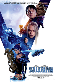
The 2010s are a curious mix of the faces in the sky trope from the 2000’s with the busier designs of the fifties, and the brand emphasis of the eighties. The combination of all of these things usually leads to very cluttered posters with lots going on, that can often be difficult to parse.
So, that’s the end of our little journey through time. We only covered a handful from each generation – if you was to track individual genres and countries the analysis could go much deeper. This was just intended to give a little taste of how film posters in general have changed over time. I wonder what the future will hold?
Do you have a favourite time period in terms of style? If so, let us know in the comments below or on our socials.
If you enjoyed this article, please consider supporting Screen Waffle by:
